12 may, 2018

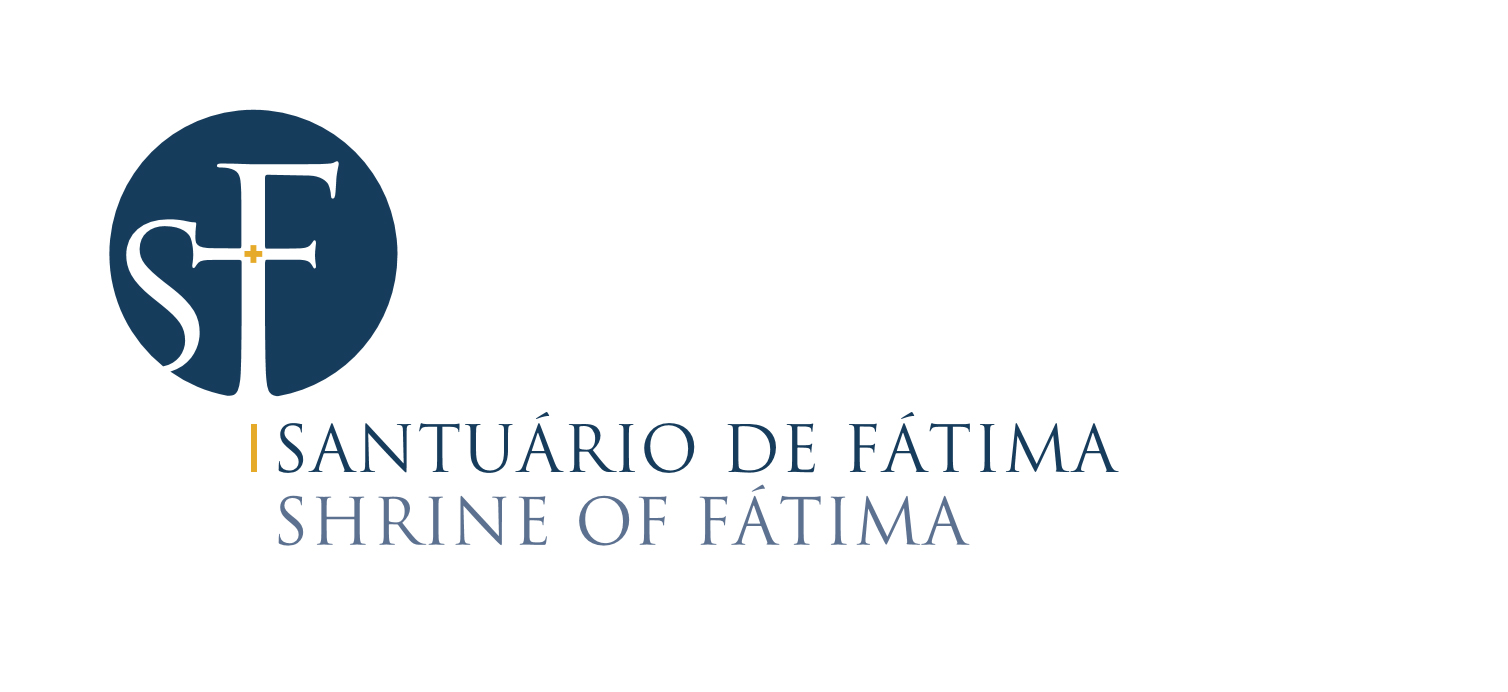
Shrine of Fatima has a new graphic identityThe new monogram was presented, this afternoon, by the rector of the Shrine.
The rector of the Shrine of Fatima, Father Carlos Cabecinhas, presented this afternoon the new monogram of the Shrine of Fatima, during the press conference that precedes the beginning of the international Anniversary Pilgrimage of May. A new logo was designed and the graphic language was upgraded especially for the Centenary of Apparitions. In that context, once the celebratory itinerary of the Centenary finished, there was the intention to remake the graphic identity of the Shrine. The distinctive feature of the Shrine of Fatima is its monogram, engraved in the tower of the Basilica of Our Lady of the Rosary. Since there was a need to rethink the graphic identity of the Shrine, bearing in mind the difficulty of interpreting the monogram, the executive team tried to come up with a new solution, in the continuity of that graphic feature. For this purpose, it was issued a call for tenders to which were invited five designers. The winning tender was the work of Inês do Carmo. While the previous monogram of the Shine of Fatima had the initials SNSRF, referring to the official designation: Santuário de Nossa Senhora do Rosário de Fátima (Shrine of Our Lady of the Rosary of Fatima), the new monogram has only SF, initials of Santuário de Fatima (Shrine of Fatima), common designation of this place and easily remembered. The new monogram of the Shrine of Fatima wants, at the same time, to maintain a link with the previous logo and also to follow the modernization of this religious space, by adding symbolic meaning to its graphic identity. It was decided to keep the rounded shape, symbolically associated to eternity, enhanced by the invitation to welcome the pilgrims, who will be able to “enter” through the “corridors” created by the intercession of the letters “S” and “F” in that same circle. The idea was to make a reference based on the specific mission of the Shrine of Fatima, as a target of so many paths of human pilgrimage, paths that are also open by the Shrine itself. Therefore, the unfinished shapes of the letters evoke what remains beyond that physical space and reenforce the idea of open doors, of the journeys already experienced and of the paths that will be taken. It was determined that only the initials “S” and “F” would be used, since they are the graphemes that carry more meaning: they are easily recognized and they are, in practical terms, a reflection of the way in which we refer to the Shrine. The official designation “Santuário de Fátima | Shrine of Fatima” was now also added to the monogram. Graphically, the “F” placed at the center acquires the dimension of cross, extending the left arm to reach the “S”, which besides the first interpretation related to the Shrine, also evokes the Marian feature of the place: (Our) Lady (Of the Rosary), near the cross of Christ. In this identity, the cross is mentioned twice: not only in the representation of the “F” but also in the concentric golden cross. Like a jewell, fine and delicate, intends to represent the presence of God in the baptized that are marked by the cross of Christ and make themselves pilgrims to Him. Chromatically, the monogram is settle in blue, which, although in iconographic terms represents the transcendence and the divine, also keeps the line of the previous version: the inclusion of the gold represents preciousness/royalty, materialized in the small central cross that highlights the light of God transmitted, according to the description of Lucia de Jesus, by the Virgin of the Rosary in Cova da Iria. |